
Under Pressure
Book design for the master in design program of Zurich Univeristy of the Arts.
Client: personal project
Printed entirely on a spirit duplicator, this book is a meta-publication of the spirit duplicator. It contains practical information about the machine while providing instructions about the printing process. Only three editions were printed and bound by hand.


An overlay of handwriting, typewriting and photocopying creates visual complexity and a signature style.
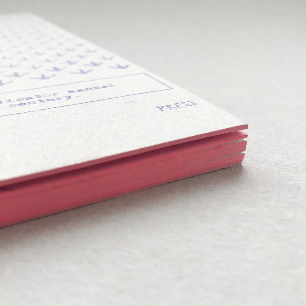
The color palette is based on what the material provides: the aniline purple of the carbon sheets builds the base, which is then combined with pale pink, the color of the paper. To balance out the purple and pink hues, I added blue for the photocopied texts and lots of grey for the surface material.
I picked pale pink paper as an homage to the early self-published books of the beat generation — especially William S. Burroughs — who printed their work, due to lack of interested publishers, with a mimeograph on pink construction paper, as you can see here.


Learn how to print with a spirit duplicator by watching the video below.
Credits
Design & layout
Sandra Staub
—
Year
2017–2018
Print
Spirit duplicator
—
Texts
Sandra Staub